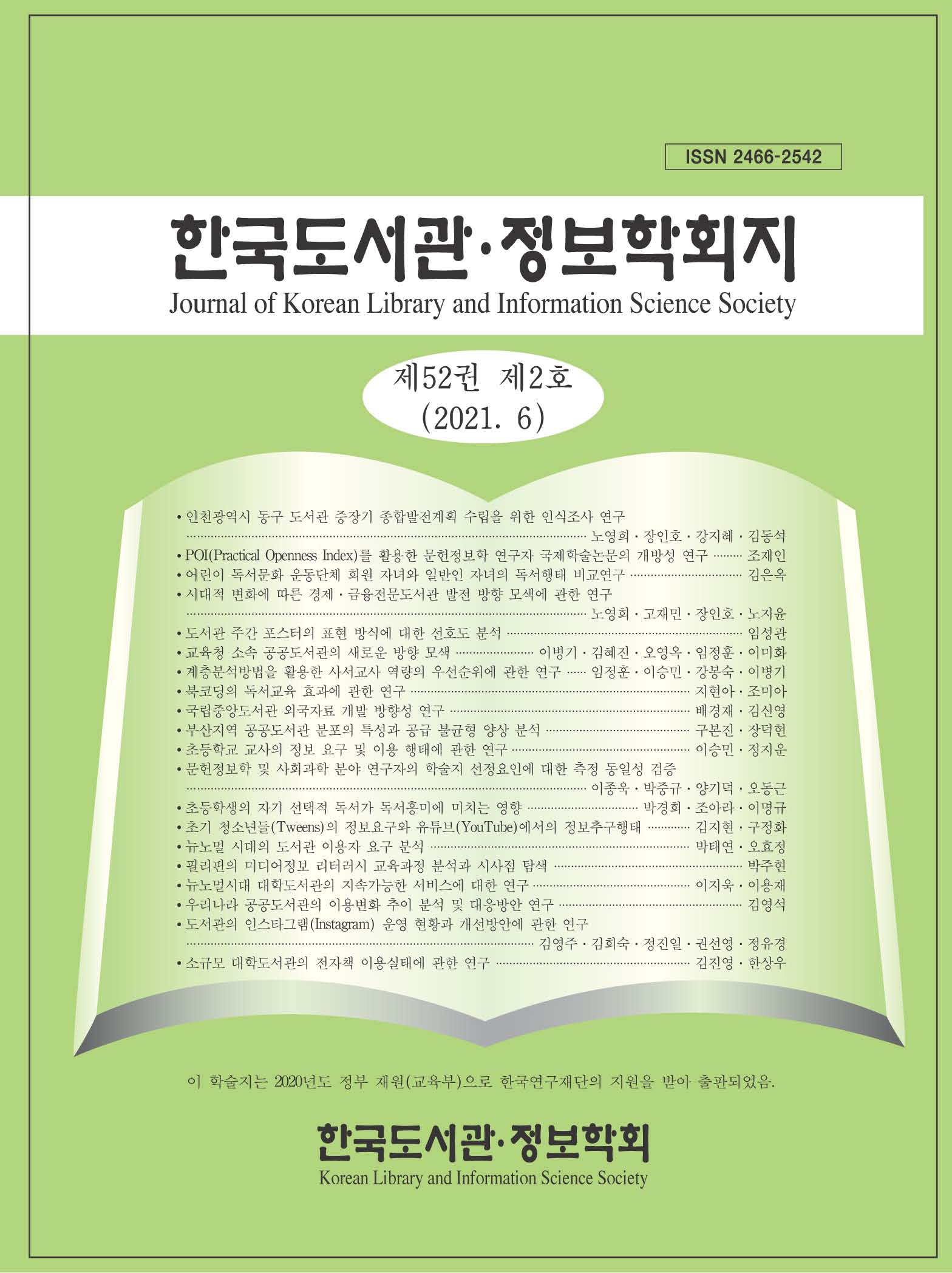
Journal of Korean Library and Information Science Society
- P-ISSN2466-2542
- KCI

Article Contents
- 2024 (Vol.55)
- 2023 (Vol.54)
- 2022 (Vol.53)
- 2021 (Vol.52)
- 2020 (Vol.51)
- 2019 (Vol.50)
- 2018 (Vol.49)
- 2017 (Vol.48)
- 2016 (Vol.47)
- 2015 (Vol.46)
- 2014 (Vol.45)
- 2013 (Vol.44)
- 2012 (Vol.43)
- 2011 (Vol.42)
- 2010 (Vol.41)
- 2009 (Vol.40)
- 2008 (Vol.39)
- 2007 (Vol.38)
- 2006 (Vol.37)
- 2005 (Vol.36)
- 2004 (Vol.35)
- 2003 (Vol.34)
- 2002 (Vol.33)
- 2001 (Vol.32)
- 2000 (Vol.31)
- 1999 (Vol.30)
Analysis of the Preference in Expression Style for the Library Weekly Poster
Abstract
The purpose of this study is to analyze the form and color of the letter layout among 31 expression methods of official posters during the library week from 1964, for 57 years, and to propose the direction of poster production in the future by revealing what citizens prefer most by conducting a survey based on the results. As a result of analyzing the poster expression form for achieving the purpose of the study, the most common character layout was 'the top position of the character' in 13 out of 31 (41.9%), and in color, 'chromatic color' in 30 out of 31 (96.8%), and the temperature of color with 'cold color', 'fading color' and 'shrink color' in 18 out of 31 (58.1%), respectively. The results of the survey showed that the most preferred was 'top position of characters' for letter layout, and 'chromatic color' and 'cold color', 'advance color' and 'expansion color' were the most preferred for the color classification. Therefore, the character layout of the weekly poster for the library needs to be produced using 'the center position of the letter', and the colors need to be made using 'chromatic color', 'warm color', 'advance color' and 'expansion color'.
- keywords
- 도서관 주간, 포스터, 도서관 주간 포스터, 표현 방식, 선호도
- Downloaded
- Viewed
- 0KCI Citations
- 0WOS Citations
